gnuplot は GPL ライセンスのグラフ作成ソフトである。
% gnuplot
として kterm 内で作業する。
> plot sin(x)
とすると、グラフが現れる。ベキは ** で表す。
x**2 を描いてみよう。
気に入ったグラフができたら、
> save "グラフ.plt"
で保存する。
以前描いたグラフを呼び出すには、
> load "グラフ.plt"
とする。
グラフを複数書きこむためには
> plot 関数 1, 関数 2
と , でつなぐ。
> set terminal postscript
したあとに、
> set output "グラフ.ps"
として PS ファイルに変換して出力させることができる。
> set terminal png
> set outout "グラフ.png"
> replot
で png ファイル型式に変換される。
実験データは、あらかじめどこかに入力しておく。 ここでは 米国 MIT、スウェーデンのウプサラ大学、筑波の KEK の計算機からの返事の速さを測定したデータで調べてみよう。
このようにして、3 つの場所について 3 回時間を変えて測定した。 それぞれ、{mit,uu,kek}i.txt (i=1,2,3), とする。 平均や標準偏差を求めるプログラムは readdata.rb とした。
それぞれの平均と標準偏差を求めたデータはこのようにまとまった。
### mit
17         213.388            4.601
### mit
16         218.687            8.254
### mit
20         214.967            4.795
### uu
18         335.554            6.975
### uu
21         331.614            3.197
### uu
17         336.369            6.889
### kek
14          26.810            5.563
### kek
18          31.252            8.441
### kek
21          30.690            8.379
次に、緯度から移動距離を計算してみよう。地球は球面なので、 球面上の距離の計算を行う。 本学(38.89N, 139.82E) から、 KEK(36.15N, 140.07) までは 360.5 km、 ウプサラ大学(59.53N, 17.38E) までは 7,801.7 km、 MIT(42:21N, 71:05W) までは 10,390.3 km と計算される。
これらのデータを使って、距離と接続の速さとに関係があるのかどうか、 グラフ化して調べてみよう。
コメントは # である。dtd10data.dat とする。
# MIT

10390.3    213.388    4.601
10390.3    218.687    8.254
10390.3    214.967    4.795

# UU

7801.7     335.554    6.975
7801.7     331.614    3.197
7801.7     336.369    6.889

# KEK

360.5      26.810     5.563
360.5      31.252     8.441
360.5      30.690     8.379
命令は、kterm で gnuplot を立ち上げ、
gnuplot> plot "dtd_gnuplot_data.dat" index 0:0 using 1:2:3 with yerrorbars, \
> "dtd_gnuplot_data.dat" index 1:1 using 1:2:3 with yerrorbars, \

> "dtd_gnuplot_data.dat" index 2:2 using 1:2:3 with yerrorbars
とする。1:2:3 は、データを右端から 1, 2, 3 と振り、横軸、縦軸、誤差とし、 データのブロックは 0:0, 1:1, 2:2 と表す。
データの名前をはっきりさせたいので、データを明示するには、
gnuplot> plot "dtd_gnuplot_data.dat" index 0:0 using 1:2:3 title "MIT" with yerrorbars, \
> "dtd_gnuplot_data.dat" index 1:1 using 1:2:3 title "UU" with yerrorbars, \
> "dtd_gnuplot_data.dat" index 2:2 using 1:2:3 title "KEK" with yerrorbars
軸の名前を明示するには
gnuplot> set xlabel "Distance [km]"
gnuplot> set ylabel "Connection Speed [ms]"
gnuplot> replot
とする。他のところも調べてみたらよいが、この 3 個所からの測定では、 接続の速さと地理的な距離には相関がなさそうであるし、 速さにばらつきはほとんど見られないようである。
gnuplot> set term tgif
Terminal type set to 'tgif'
Options are 'portrait [1,1] dashed "Helvetica" 18'
gnuplot> set output "保存したいファイル名.obj"
gnuplot> replot
gnuplot> save "保存したいファイル名.plt"
gnuplot> quit
直接 gs ファイルなどでもよいが、白黒になってしまうので、 カラーで保存したければ、tgif ファイルにしたあと、 tgif を使って保存するとよい。
円周率を求めるのに 2 次元配列として、 ふったサイコロの組み合わせを座標として求めるプログラムで 実行状態を再現するグラフを書いてみよう。
最小自乗法には fit を用いる。 最初に乗るべき関数を定義したあと、パラメータを計算させる。
> plot "planet081104_dat" > f(x) = a * sin(x) + b * cos(x) + c
使ったデータはこれ
> fit f(x) "planet081104_dat.dat" via a, b, c
Iteration 0
WSSR        : 1.09142e+19       delta(WSSR)/WSSR   : 0
delta(WSSR) : 0                 limit for stopping : 1e-05
lambda    : 0.816497

initial set of free parameter values

a               = 1.66317e+09
b               = -2.15942e+08
c               = 5.04586e+08
**/

Iteration 1
WSSR        : 1.09142e+19       delta(WSSR)/WSSR   : -3.7529e-16
delta(WSSR) : -4096             limit for stopping : 1e-05
lambda    : 8.16497

resultant parameter values

a               = 1.66317e+09
b               = -2.15942e+08
c               = 5.04586e+08

After 1 iterations the fit converged.
final sum of squares of residuals : 1.09142e+19
rel. change during last iteration : -3.7529e-16

degrees of freedom (ndf) : 6
rms of residuals      (stdfit) = sqrt(WSSR/ndf)      : 1.34872e+09
variance of residuals (reduced chisquare) = WSSR/ndf : 1.81904e+18

Final set of parameters            Asymptotic Standard Error
=======================            ==========================

a               = 1.66317e+09      +/- 6.271e+08    (37.71%)
b               = -2.15942e+08     +/- 7.384e+08    (341.9%)
c               = 5.04586e+08      +/- 5.132e+08    (101.7%)


correlation matrix of the fit parameters:

               a      b      c
a               1.000
b              -0.070  1.000
c               0.114 -0.475  1.000
最小自乗法のパラメータを計算したあとに
> replot f(x)
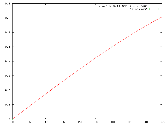
正弦関数を小数値に計算したものをしまうプログラム。 実行結果と、これを gnuplot で グラフにのせる作業例は以下の通り。
gnuplot> plot sin(pi * x / 180) with lines, "sine.dat" with yerr
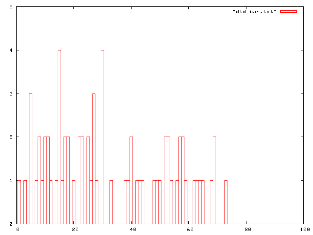
ある年の得点データの分布がこのようだったとする。
Terminal type set to 'x11'
gnuplot> set boxwidth 1
gnuplot> plot [0:100][0:10] "bar.txt" with boxes
gnuplot> set term png
Terminal type set to 'png'
Options are 'small color picsize 640 480 '
gnuplot> set output "bar.png"
gnuplot> replot
gnuplot> save "bar.plt"
gnuplot> quit
最後は念のために Gnuplot 形式で保存した。 グラフは次のようになる。
振幅は、中心の位置からどれだけ離れたかという距離を測ったもの。 ある方向を正ととると、 同じ距離だけ離れて反対側にある場合は負ということができる。
前回までに作った度数表で、半径 1 とした場合の振幅を調べよ。 またそれは何を調べることに計算できるか。
Ruby 言語で、module を使い、Math::sin(x) で調べよ。
弧度法と度数を表にした一覧を、 出力するプログラム dtd_radian.rb が radian.csv として、CSV 形式で値を出力するように作成せよ。
ruby+gnuplot が使える。
#!/usr/koeki/bin/ruby
#coding: euc-jp

require 'gnuplot'

 Gnuplot.open do |gp|
   Gnuplot::Plot.new( gp ) do |plot|

     plot.title  "Array Plot Example"
     plot.ylabel "x"
     plot.xlabel "x^2"

     x = (0..50).collect { |v| v.to_f }
     y = x.collect { |v| v ** 2 }

     plot.data << Gnuplot::DataSet.new( [x, y] ) do |ds|
       ds.with = "linespoints"
       ds.notitle
     end
   end
 end
#!/usr/koeki/bin/ruby
# -*- coding: euc-jp -*-

require 'gnuplot'

Gnuplot.open do |gp|
  Gnuplot::Plot.new( gp ) do |plot|
    plot.xrange "[-10:10]"
    plot.title  "Sin Wave Example"
    plot.ylabel "x"
    plot.xlabel "sin(x)"
        plot.data << Gnuplot::DataSet.new( "sin(x)" ) do |ds|
      ds.with = "lines"
      ds.linewidth = 4
    end
  end
  #sleep 10
end
#!/usr/koeki/bin/ruby
# -*- coding: euc-jp -*-

require 'gnuplot'


Gnuplot.open do |gp|
   File.open( "gnuplot.dat", "w") do |gp|
   Gnuplot::Plot.new( gp ) do |plot|

     plot.xrange "[-10:10]"
     plot.title  "Sin Wave Example"
     plot.ylabel "x"
     plot.xlabel "sin(x)"

     x = (0..50).collect { |v| v.to_f }
     y = x.collect { |v| v ** 2 }

     plot.data = [
       Gnuplot::DataSet.new( "sin(x)" ) { |ds|
 	ds.with = "lines"
 	ds.title = "String function"
 	ds.linewidth = 4
       },

       Gnuplot::DataSet.new( [x, y] ) { |ds|
 	ds.with = "linespoints"
 	ds.title = "Array data"
       }
     ]

   end

 end
#!/usr/koeki/bin/ruby
# -*- coding: euc-jp -*-

require 'gnuplot'


   Gnuplot::SPlot.new( gp ) do |plot|

     plot.xrange "[-10:10]"
     plot.yrange "[-10:10]"
     plot.title  "Example"
     plot.ylabel "y"
     plot.xlabel "x"
     plot.zlabel "z"

     x_dots = Range.new(-10, 10).to_a
     y_dots = Range.new(-10, 10).to_a

     data = Array.new
     z = Array.new
     x_dots.each_with_index do |x, i|
       z[i] = Array.new
       y_dots.each_with_index do |y, j|
         z[i][j] = x ** 2 + y ** 2
       end
     end
     data = [x_dots, y_dots, z]

     plot.data << Gnuplot::DataSet.new( data ) do |ds|
       ds.with = "points"
     end
   end
 end
濃度算の求めかたのパターンをもとめ、 ランダムに内容物を変えて、問題を出せるようなプログラムを考えてみよう。